Box plots for tracking volatility in silver prices
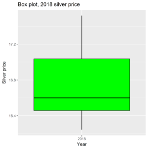 In the social sciences, the box plot is a popular graph. It’s because it contains so much information. It is based on two metrics, the median and the interquartile range (IQR). The median is the central data point. So let’s take daily silver prices for 2018. My data isn’t perfect, but I get a median of 16.6 – half the data points are above 16.6, half below. The IQR is the distance between the 25th and 75th percentiles. The 25th percentile is 16.46, the 75th percentile 17.04. This is the box on the box plot – the solid rectangle between the 25th and 75th percentiles. The median is the line which cuts the box horizontally. The box then has whispers which extend up to one and a half times the length of the box. Any data point which goes beyond this limit is marked individually, as an outlier.
The box plot then gives a graphic description of the data and its range. We can then create a graph of box plots, to show how the range of data has changed over time. For example, we can assign one box plot for each year:

The data for 2007 and 2018 are incomplete, but one gets the picture. Note the outliers in 2007, 2010, and 2017. In the last few years the range of silver prices, and therefore the volatility, has been collapsing. In 2018 the range has been constrained to a range of about a $1.50. Could this be a coiled spring? Could it uncoil one way or both ways?